North’s 2008 design manual for First Direct is featured in our book, Manuals 2: Design & Identity Guidelines. It is presented here as our second case study on some of the outstanding projects in the collection (the first, on Reuters, is here), posted to coincide with our Kickstarter campaign to republish the book – which is live now. With your help we can bring this important title back into print!
The 224-page document that North created for telephone- and internet-bank First Direct in 2008 is a little different to most design manuals.

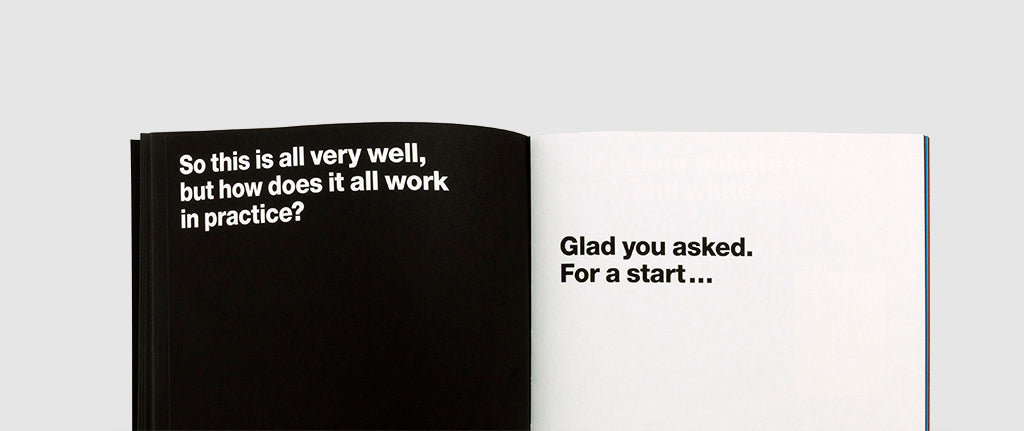
‘Black & White: A Conversation’ introduced a branding overhaul for the bank (founded in 1989 by Midland Bank), which included a new vertical logo and minimalist black and white colour palette.

But in addition to conveying how the refreshed identity would work, the manual functioned as a wider brand book, with tone of voice a vital component. Through the bank’s new guidelines, the copywriters employed a plain-speaking, conversational tone – and produced a manual that was actually, well, funny.

In terms of its visual aspect, North provided a guide to type size and line spacing for headlines and body text, introduced the use of Helvetica Neue (45, 85), and included a coloured section that functioned as a manual for image usage.

“Black and white means honest,” runs the copy in the book’s Introduction. “You know, if you say, it’s there in black and white that means you’ve got nothing to hide. You can always tell what’s on our mind. We don’t need to elaborate.

“In fact, you could argue that our brand identity says more than any strapline ever could. It’s simple. Honest. Straightforward. In black and white. What else is there to say?”

In the world of global banking 2008 is largely remembered for the catastrophic crisis that engulfed the industry and caused massive distrust of the sector – still tangible over a decade later. And with hindsight, North’s work for First Direct might seem bold, brazen even, given the climate.

Yet, by this point, the bank’s own reputation was already built on strong customer service satisfaction – not to mention a revered ethical stance – so ensuring that it continued to play to its strengths seems to have been a very wise decision; crystallised here in a cleverly-designed (and amusing) graphics manual.
The design manual for First Direct (2008) is one of 20 featured in our book, Manuals 2 (spread shown, above). With your help we can republish the title – visit our Kickstarter to find out more about the publication and to see the rewards available.