With two UK design magazines celebrating anniversaries this month (Creative Review turns 40 while Eye publishes its 100th issue), we thought we’d take the opportunity to look at some of the work included in our Impact 2.0 book, which features a selection of the best covers created for design magazines and journals between 1974 and 2016.
There are in fact 15 covers of Typographics ti: included in Impact 2.0, such is the quality of the design of the Japanese magazine, which also marks its 40th year in print in 2020.


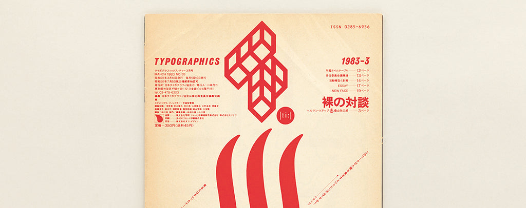
First published in May 1980, Typographics ti: is the quarterly magazine of the Japan Typography Association. The JTA emerged out of the Japan Lettering Designers Association in 1971 with a membership made up largely of typeface designers, researchers and educators.


The aim of the JTA, it says, is to further the development of typography alongside “better communication through the creation and research of visual languages such as letters, symbol marks and pictograms [and how they are used]”. Its Typographics ti: magazine also reflects these aims in its wide-ranging content.


The covers of Typographics ti: shown here are from its earliest years, 1980-83 — a period where it clearly wasn’t afraid to experiment with bold design.


A total of 15 Typographics ti: covers are featured in Impact 2.0: Design magazines, journals and periodicals [1974–2016], which is available now from the Unit shop as a single edition, or as part of a two-volume set with Impact 1.0 [1922–73].
