
Lance Wyman talks Process
By Mark Sinclair Our new book, Lance Wyman: Process, is a near facsimile of the leather-bound ‘sketchbook’ that the US designer made when working on his proposal for the 1976 American Bicentennial identity. The book opens with an interview with Wyman where he discusses how the project began, how his design thinking evolved over its duration, and how an understanding of his own ‘process’ became integral to the creation of the work. An edited extract of this conversation with Adrian Shaughnessy is featured below. Wyman’s original book catalogues the work he produced in collaboration with the architect Michael Cohalan, which was submitted in a competition to design a logo and graphic identity for the 1976 Bicentennial celebrations that would mark the creation of the USA as an independent republic. By 1970, Wyman had acquired quite a reputation. His...

Lars Harmsen: visual crashes in Letraset
By Mark Sinclair Lars Harmsen, a Munich-based creative director and the co-founder of Melville studio and Slanted magazine, has been publishing a personal visual diary to his Instagram account which makes interesting use of Letraset. We included some examples of his work in our book on the lettering system – and recently spoke to him about his process and what has drawn him back to this analogue practice. In using a rubdown instant-transfer version of the typeface FF Clan, Harmsen makes “striking typographic compositions that are free from the inflexibility of computer software,” we write in Letraset: The DIY Typography Revolution. “I started the rub-off-type-diary a year ago,” Harmsen says. “All the pieces are in a thick blue book. I pick up stuff from the news. They...

At the Franco Grignani archive
By Mark Sinclair Last week, Unit’s Tony Brook and I were lucky enough to get the chance to visit the archive of artist and graphic designer, Franco Grignani (1908-99). Thanks to the work of his daughter, Manuela, the Milan-based collection records Grignani’s working life in vivid detail and contains thousands of original works, proofs, sketches and projects he produced over fifty years. Joined by Mario Piazza, founder of 46xy studio and former AIAP president, the opportunity to see so many of Grignani’s visual explorations on paper was a real privilege. Housed in a basement studio beneath an apartment building in central Milan, the Grignani archive is a large space divided into two main areas: paintings and prints are housed in racks on...

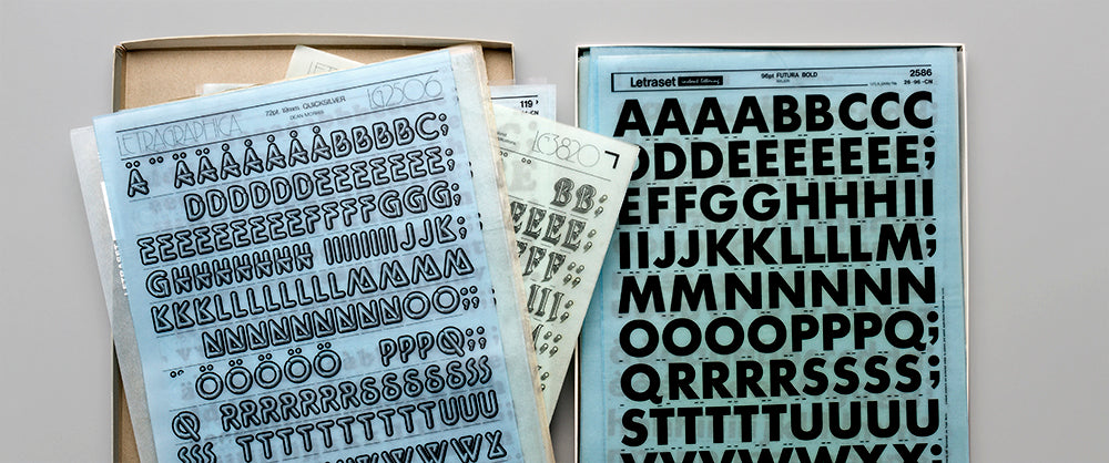
Letraset, Lubalin and ligatures – in newsprint
By Mark Sinclair Two things close to Unit Editions’ heart – Letraset and Herb Lubalin – came together recently in the form of a broadsheet newspaper produced by the Herb Lubalin Study Center and Adobe Type’s Dan Rhatigan. Made in collaboration with Newspaper Club, ‘100% Lubalin Letraset’ was created for Day 90 of the Center’s #Lubalin100 project that has been celebrating the designer’s centenary. The newspaper features 17 images of Lubalin’s typefaces as they appeared on sheets of the lettering system in the 1970s. Each sheet comes from Rhatigan’s own collection and he introduces the paper with a text on Lubalin’s International Typeface Corporation (ITC), the foundry that the US designer launched with Aaron Burns and Edward Rondthaler in 1970. ITC...

‘You feel you’re there – in his head’. On the appeal of Lance Wyman’s sketchbooks
By Mark Sinclair Designer Jim Sutherland recently tweeted his admiration for US graphics legend Lance Wyman’s sketchbook work, which is collected together in our book, Lance Wyman: The Visual Diaries 1973-1982. What is it about preparatory drawings, work-in-progress doodles and annotated ideas on paper that people find so appealing? We asked Sutherland about what this insight into Wyman’s working practice gave him – and how sketching fits into his own graphic design practice. Limited copies of Lance Wyman: The Visual Diaries are still available from the Unit shop. Mark Sinclair: What does seeing Wyman’s sketch work presented like this mean to you as a designer? Jim Sutherland: I love seeing the thought process and progression of ideas. From initial sketches and variations to the final iterations...

How I made Letraset: an interview with Freda Sack
Over the next few weeks we’re featuring a selection of highlights from our Letraset book, our visual history of the rubdown lettering system that revolutionised typographic expression. For our second extract, we have an interview with type designer and typographer, Freda Sack, who joined Letraset in the 1970s and worked in its Type Studio. While there she perfected the art of cutting master letterforms from Rubylith using tools that she made and customised herself. Adrian Shaughnessy talked to her about her fascinating career. (Our first post looked at how Letraset became a staple of the DIY attitude to music-making in the late 1970s early 80s.) Letraset: The DIY Typography Revolution is available now from the Unit Editions shop. The negative film masters and...
Letraset, design and music
Over the next few weeks we’re going to be featuring a selection of highlights from our Letraset book, our visual history of the rubdown lettering system that revolutionised typographic expression. In our first post we look at how Letraset helped to bring about the visual language of punk and became a staple of the DIY attitude to music-making established in the late 1970s and early 80s. Letraset: The DIY Typography Revolution is available now from the Unit Editions shop. In recent years, articles on Letraset have appeared in leading design magazines, and events have been held celebrating the craft and expert knowledge that underpinned the making of the Letraset typographic system. This enthusiasm extends to a new younger generation of designers who have known nothing but the computer screen and...

Impact 1.0 & 2.0: Type only!
This month we’re featuring highlights from our two-volume Impact books that bring together some of the best covers created for design magazines and journals from the 1920s to the present day (both are now £29 each in the Unit shop, or available as a bundle for £50). For our fourth post, we’re putting the focus on type – and looking at some of the most interesting typographic approaches to covers that feature in the two books. [Our first post, on Swiss titles from the mid-1950s, is here; our second, on 1960s type and pattern experiments, is here; our third, on IDEA magazine, is here.] Type-based covers have been a staple of design magazines since their inception. Some of the fine examples of designs for both Grafische...

Impact 1.0 & 2.0: IDEA magazine
This month we’re featuring highlights from our two-volume Impact books that bring together some of the best covers created for design magazines and journals from the 1920s to the present day (both now £29 each in the Unit shop). For our third post, we’ve picked four covers from Japan's IDEA magazine. [Our first post, on Swiss titles from the mid-1950s, is here; our second, on 1960s type and pattern experiments, is here.] Founded in 1953, IDEA is a quarterly showcase of graphic design, typography and communications. Since its earliest editions it has spotlighted various areas of design practice by approach and also location. During the 1950s and 60s, for example, it reported on design work from specific parts of Japan – from the Hokuriku District to Hokkaido –...

Impact 1.0: The 1960s and visual experimentation
This month we’re featuring highlights from our two-volume Impact books that bring together some of the best covers created for design magazines and journals from the 1920s to the present day (both now £29 each in the Unit shop). For our second post, we’ve picked four magazine covers from the 1960s that show some of the experimental approaches in type and pattern that design titles were using at the time. [Our first post, on Swiss titles from the mid-1950s, is here.] Canadian designer Carl Dair designed all six issues of A Typographic Quest, a slim booklet that was published as the house journal of the West Virginia Pulp and Paper Company (Westvaco) in 1964. Shown above is the cover of its second issue which...