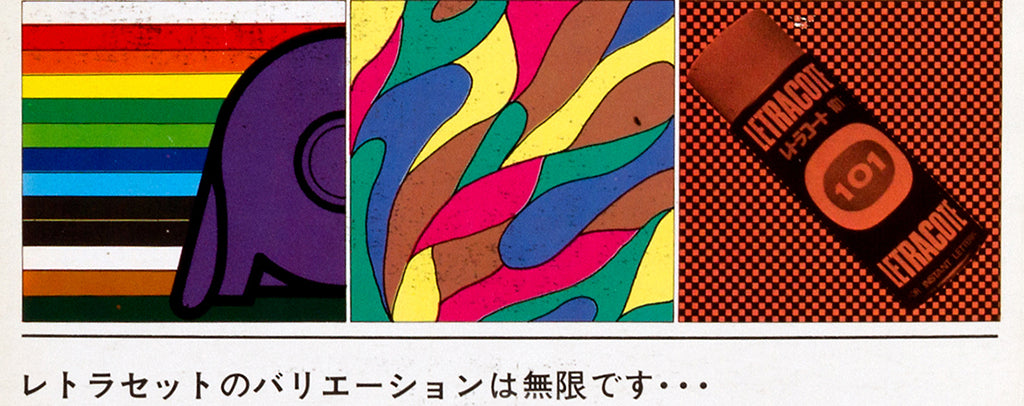
Selling Letraset in Japan
Our Letraset book includes examples of the promotional literature the company created to sell its product — here, we feature some of its print ads created specifically for the Japanese market in the 1970s.
A lockdown reading list
Last week we asked our newsletter subscribers to nominate a favourite design-related book that they’ve turned to for inspiration in these strange and stressful times. Here are their recommendations.
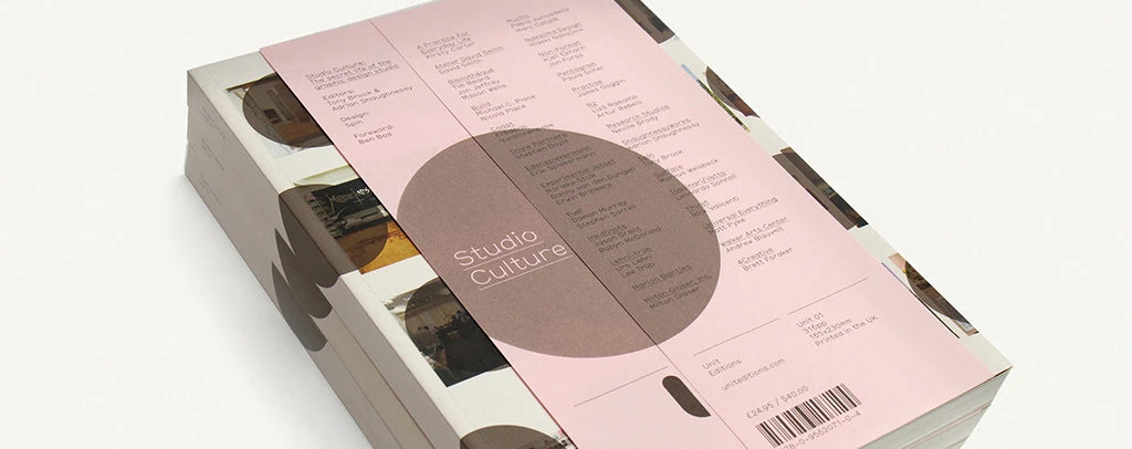
Studio Culture interviews — free to download
We’ve made some of the Q&A interviews from our very first book, Studio Culture: The Secret Life of the Graphic Design Studio (2009), available as a series of free, downloadable PDFs – and you can grab them here.
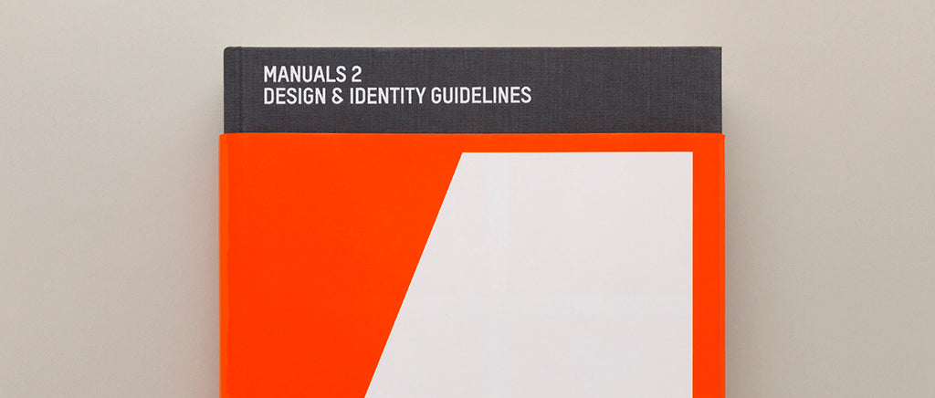
Manuals 2 – interview with Michael Burke
In this extract from Manuals 2: Design & Identity Guidelines, Michael Burke and R. Roger Remington discuss the history and relevance of graphic standards manuals.
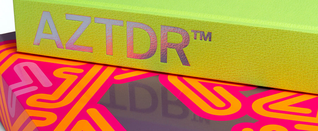
Ian Anderson on the making of AZTDR™
We talk to Ian Anderson about putting AZTDR™ together – how he selected the projects and told the stories of their evolution from over 30 years of The Designers Republic™.
Ian Anderson’s top ten TDR™ sleeves
Ian Anderson picks ten of his personal highlights from the 250 single and album covers featured in AZTDR™ – from Autechre and Plaid, to PWEI and Aphex Twin.
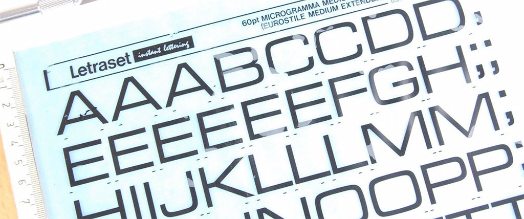
Designers pick their favourite Letraset typeface
In its heyday, the sheer variety of Letraset type available was one of the reasons the lettering system became an important tool in many a designer’s practice. We asked several friends of Unit Editions for their favourite Letraset typeface, or the one that means the most to them – the majority of which feature in Letraset: The DIY Typography Revolution, which is now available from the Unit shop for just £25 (for one month only). Read about their choices, from Sunshine to Frankfurter, Clarendon to Compacta, below. Paula Scher, PentagramMy favourite Letraset typeface was Helvetica Medium, which seemed to be the only one they had at the Tyler School of Art art supply store, where I sometimes worked.Since I could never rub down the type without it...
Unit/10 book list – Adrian Shaughnessy, Unit Editions
For the third in our series of Unit/10 book lists, posted as part of our ten year anniversary celebrations, Unit Editions co-founder Adrian Shaughnessy picks ten of his favourite design and visual culture books.These are not the only design and visual culture books I hold in high regard. There are dozens of others. But these represent a cross section of the books I turn to for research, for inspiration, and for the sheer joy of looking at images, reading good texts and handling well-made and well-designed books. Tadao Ando: Complete Works – Francesco Dal Co (Phaidon, 1997)My favourite architect. His use of natural light is a design triumph, likewise his use of concrete. His buildings should be enjoyed in person – but if you can’t...
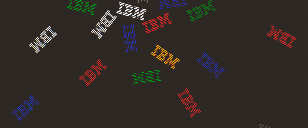
Manuals 2 case study: IBM
There are, in fact, four IBM design manuals featured in Manuals 2: Design & Identity Guidelines. Images from three are shown here, as part of our final case study on some of the outstanding projects in the M2 collection, posted to coincide with our Kickstarter campaign to republish the book – which is live now. With your help we can bring this important title back into print!In the IBM chapter in Manuals 2, alongside images from the documents that focused on the graphic identity for the corporation’s Product Center and its Sign Standards, two manuals – from 1978 and 1990 – concern themselves specifically with the classic Paul Rand-design logo and its usage. IBM’s understanding of the role of design in business had begun...
Manuals 2 case study: First Direct
North’s 2008 design manual for First Direct is featured in our book, Manuals 2: Design & Identity Guidelines. It is presented here as our second case study on some of the outstanding projects in the collection (the first, on Reuters, is here), posted to coincide with our Kickstarter campaign to republish the book – which is live now. With your help we can bring this important title back into print! The 224-page document that North created for telephone- and internet-bank First Direct in 2008 is a little different to most design manuals. ‘Black & White: A Conversation’ introduced a branding overhaul for the bank (founded in 1989 by Midland Bank), which included a new vertical logo and minimalist black and white colour palette. But in addition to...